This project was a collaboration with my Community Design Studio class and Flint, Michigan’s Pierce Park Nature Preserve. The collaborators reached out to us, asking us to help design new signs and layouts for their pollinator garden, sprucing it up with color and creativity. This project explores not only collaboration with other parts of the community but also communication between parties.
Pierce Park Pollinator Garden
February 20th
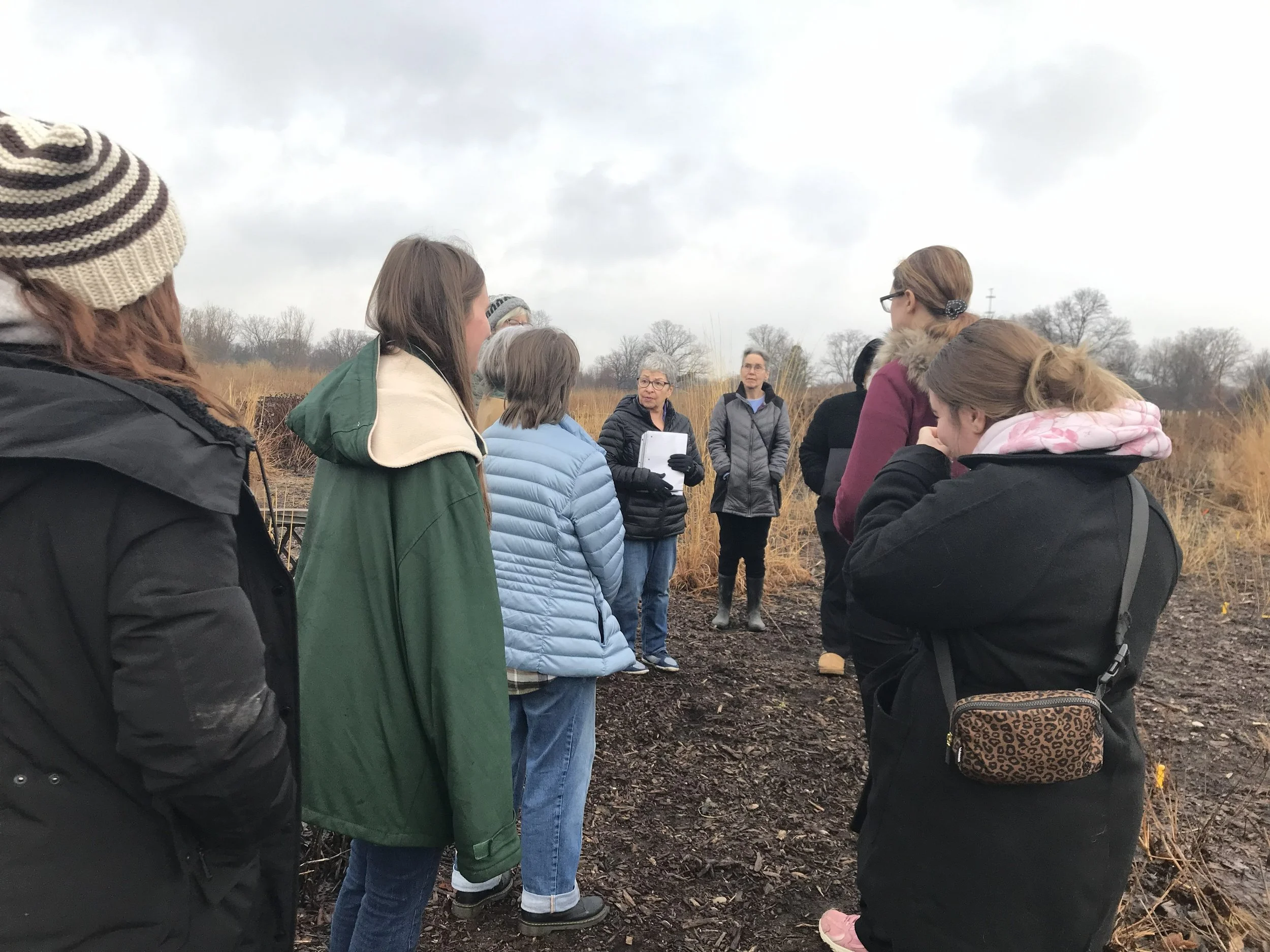
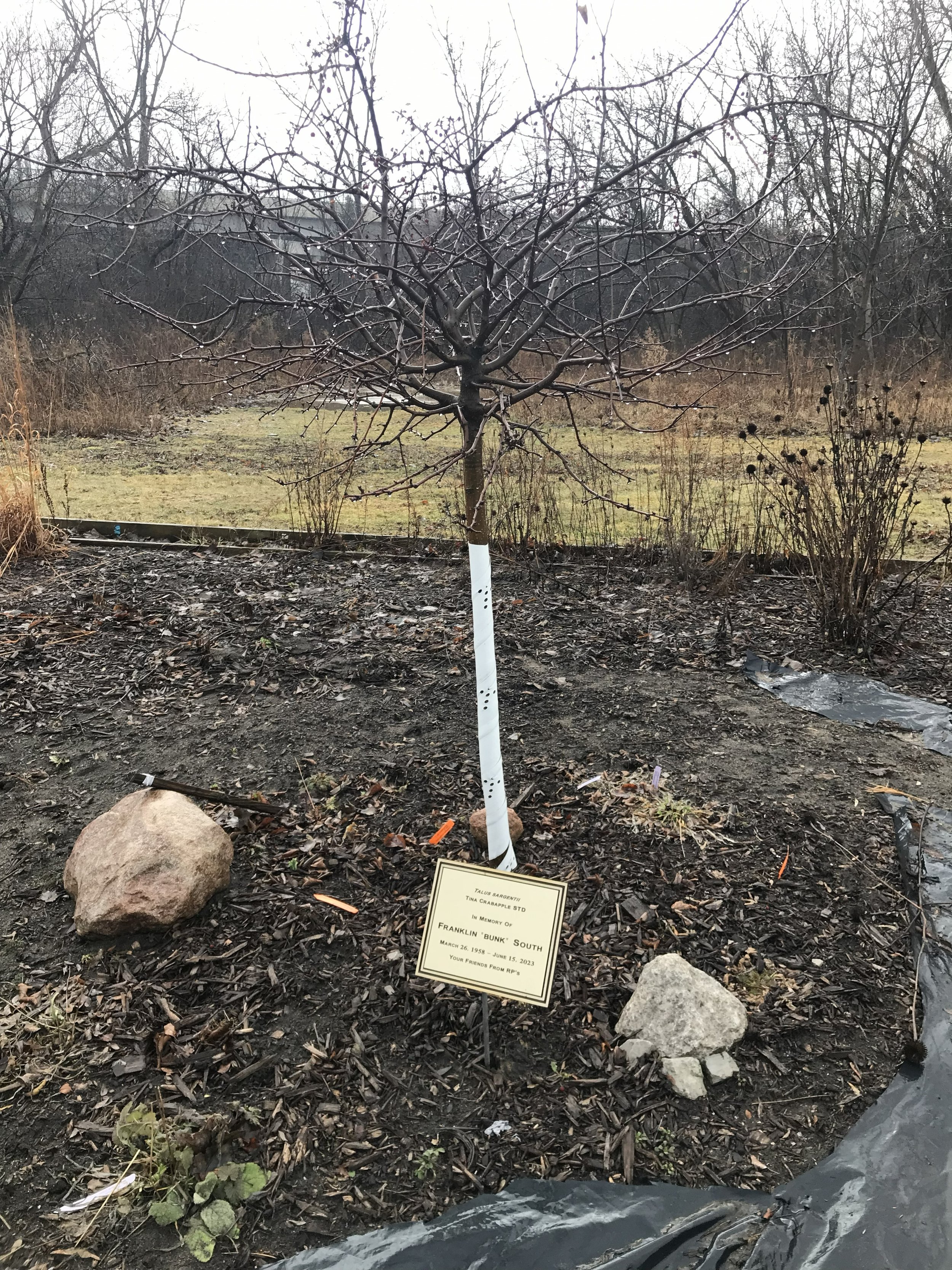
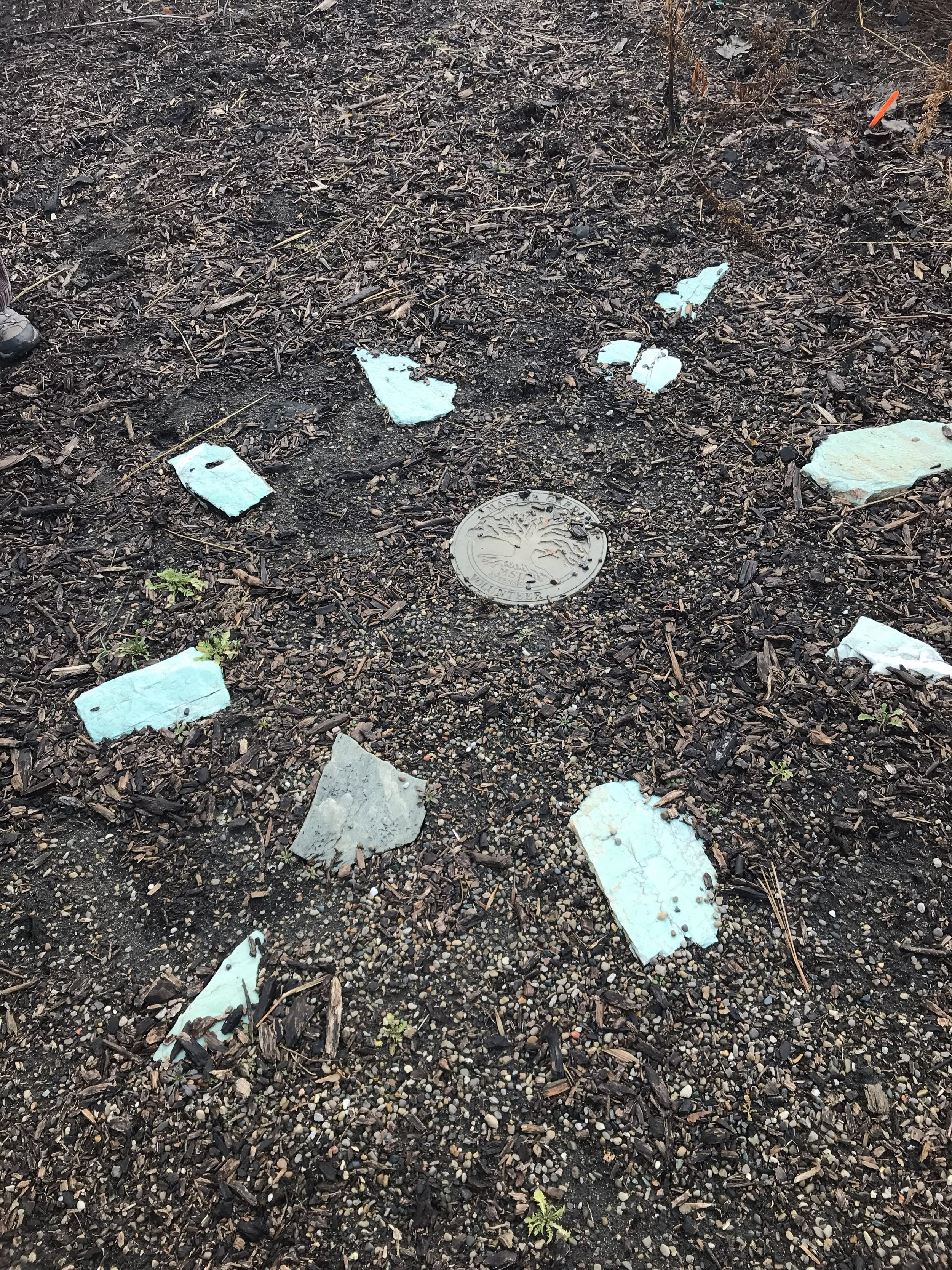
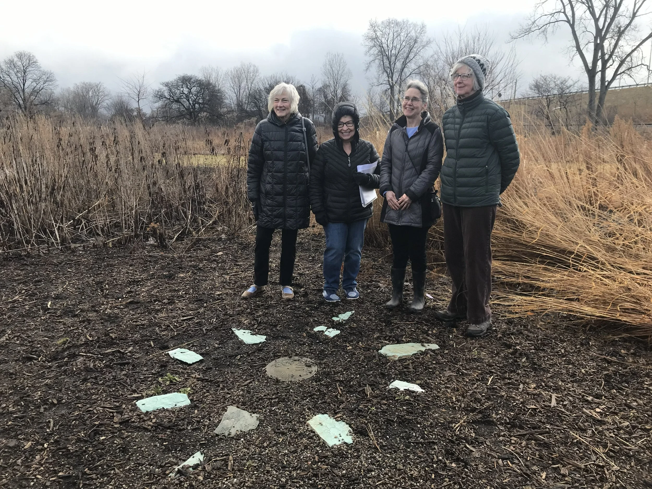
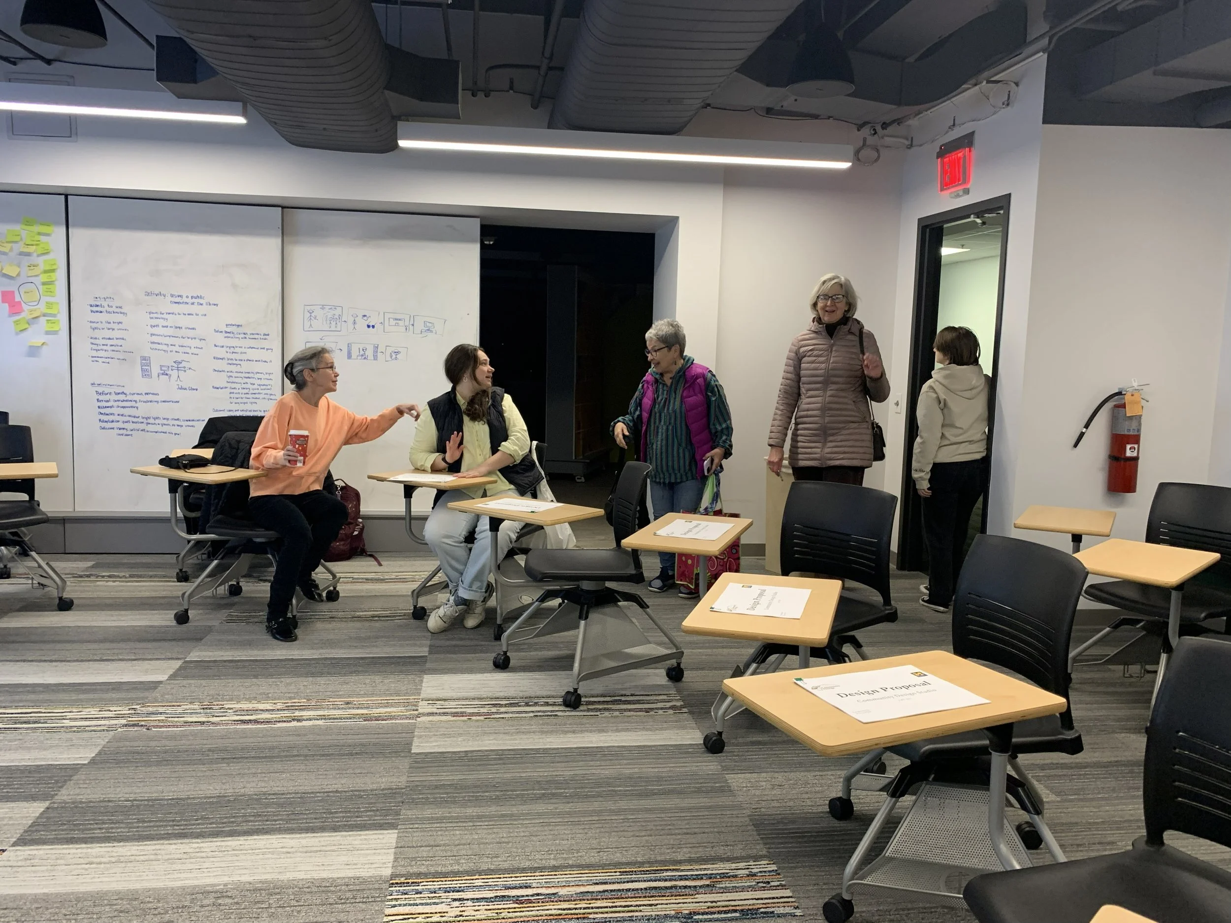
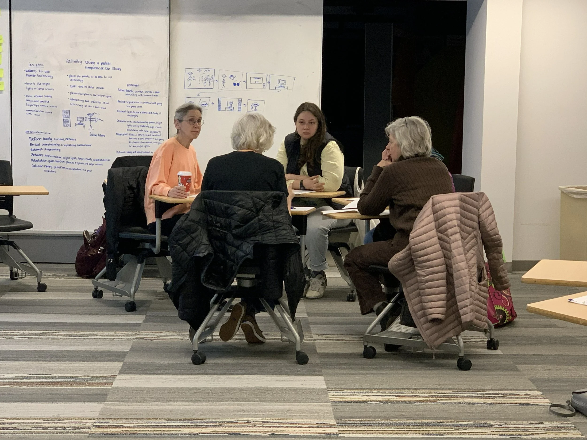
The day when the whole class visited the Nature Preserve and Pollinator Garden. We met the kind coordinators of the garden, who had their own ideas for signage and a centerpiece for the middle of the garden.
Snapshots of our visit to the Pollinator Garden at Pierce Park Nature Preserve
Video recording of our visit
For our collaboration with Pierce Park, the coordinators would like our group to design signage for the garden's local plants. They even mentioned doing a centerpiece for the garden. So our group did mock-ups for signage, centerpieces, and even logo designs for the pollinator. These are my mock-ups; only my sculpture was picked for the proposal.
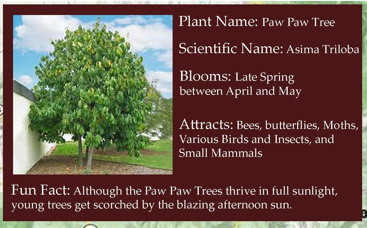
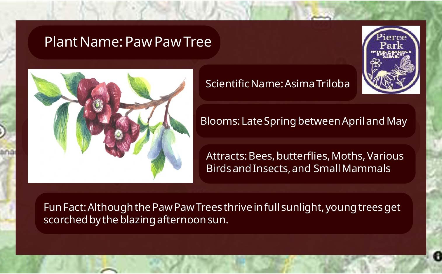
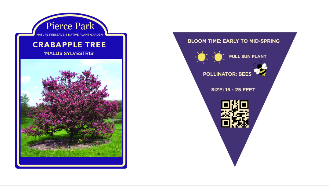
The signage we wanted to incorporate features of the plant’s name, its scientific name, when it blooms during the year, and one or two facts about the plant. I made the sign based on the PawPaw Tree as an example. The top image is the rough draft, the second one is the final revision.
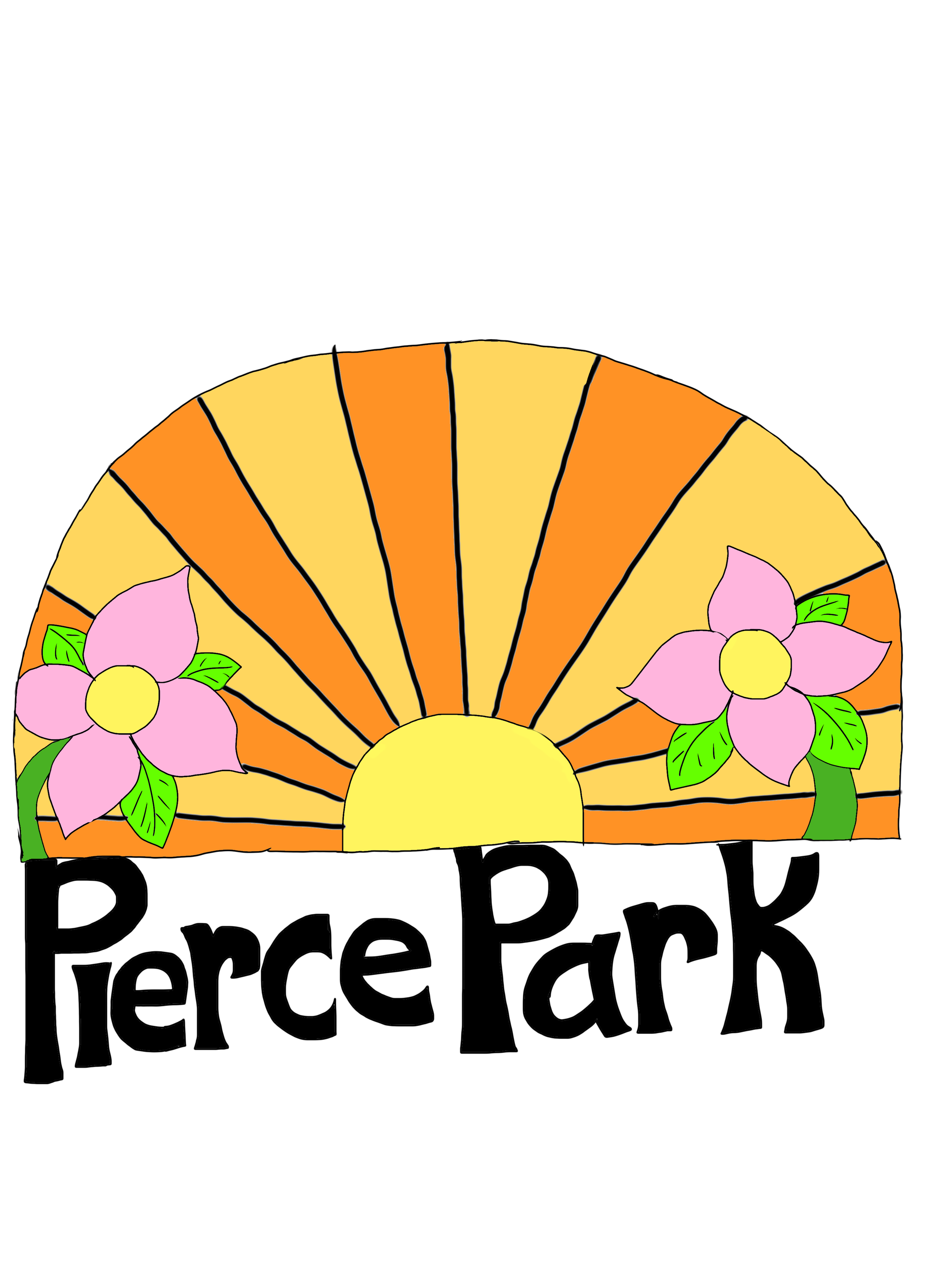
The logos are based on the warm feeling of being invited into a garden. The bright colors are charming, and the inclusion of flowers resembles a garden. It represents a hippie vibe, which was an era of color and peaceful energy, and what a pollinator garden is supposed to bring in.
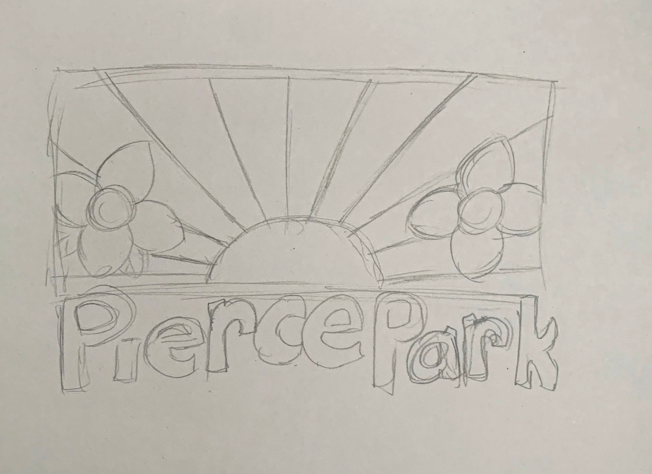
The image on the left was the first rough draft of the logo mockup. The second image on the left is a more finished piece, with color, and the rectangle was made into an arch shape. That way, the logo was more inviting. The typography for the park was a little uneven, but it was made to be fun and creative, like an actual park.

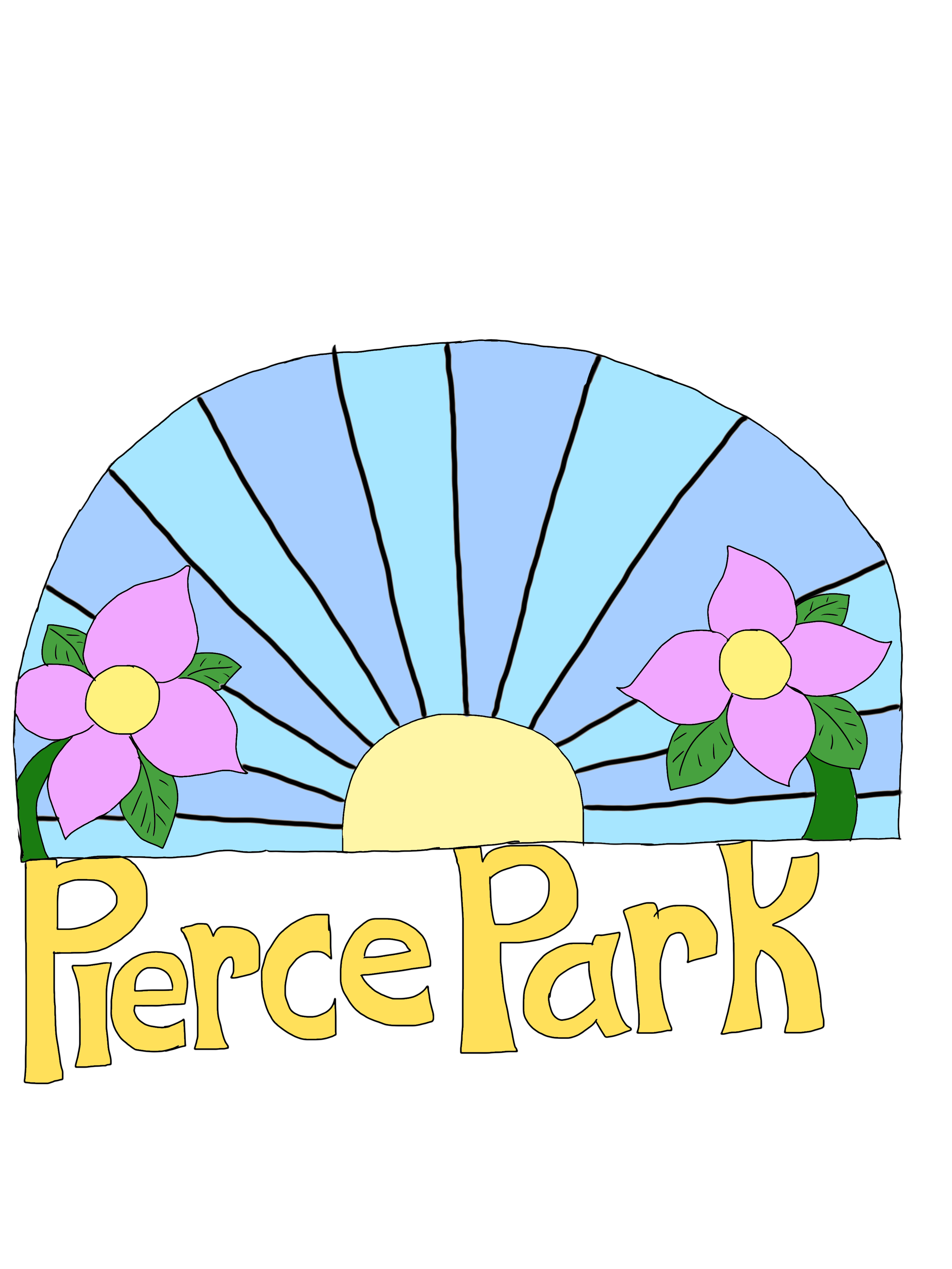
Below are digitalized versions of the logo. Both logos have pink flowers, as pink is one of the most common colors in a pollinator garden. The image on the left has a warm, inviting style that resembles a sunny day, but can also resemble a sunrise or a sunset. The second image on the right has a cooler yet nice style that resembles a sunny day, which can represent a spring or summer theme. Both contain big, bold letters of ‘Pierce Park’, but as the letters on the left are black, the letters on the right are yellow.
My Designs
Signage
Logo Mock-ups
Sculpture Design
Below is the revised, finalized logo design of ‘Pierce Park Nature Preserve’. I kept the original feeling of the archway sky from the previous blue design, along with the flowers and the sun hues. However, I took out the black lines so the colors are more in sync with one another, and added the full park’s name underneath.

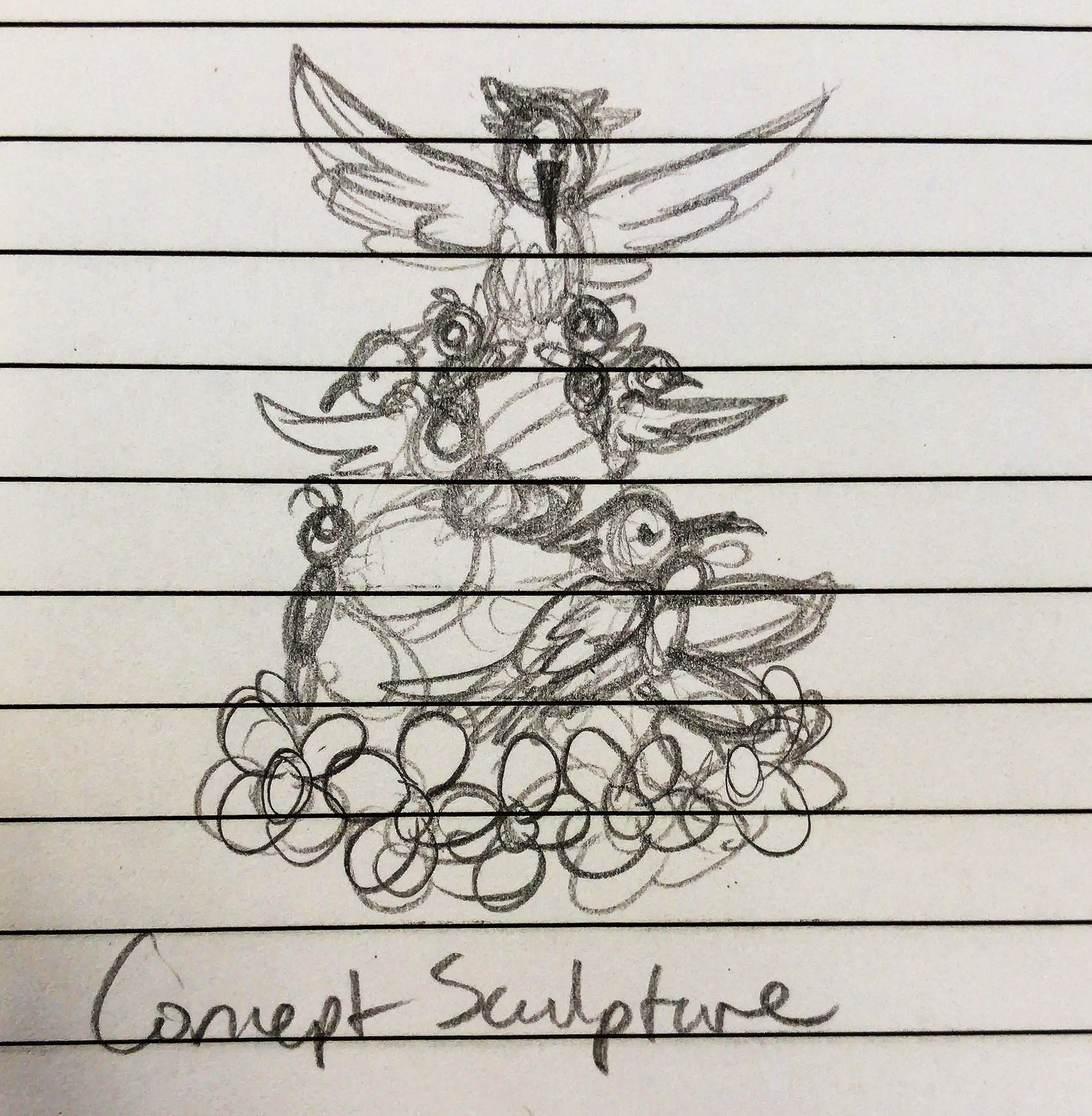
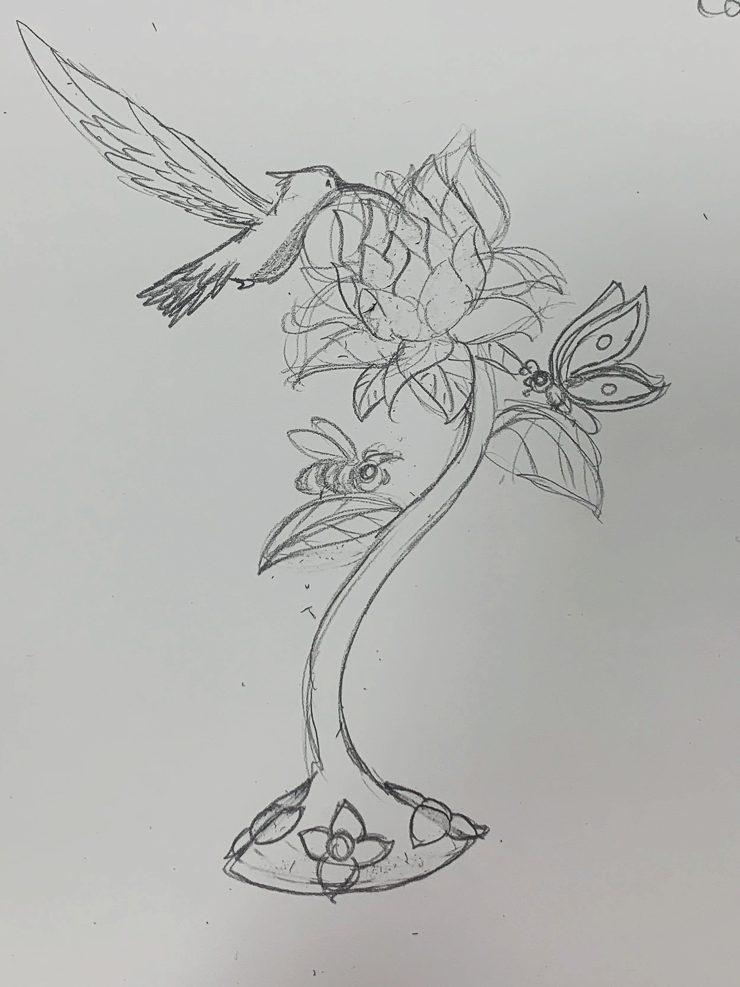
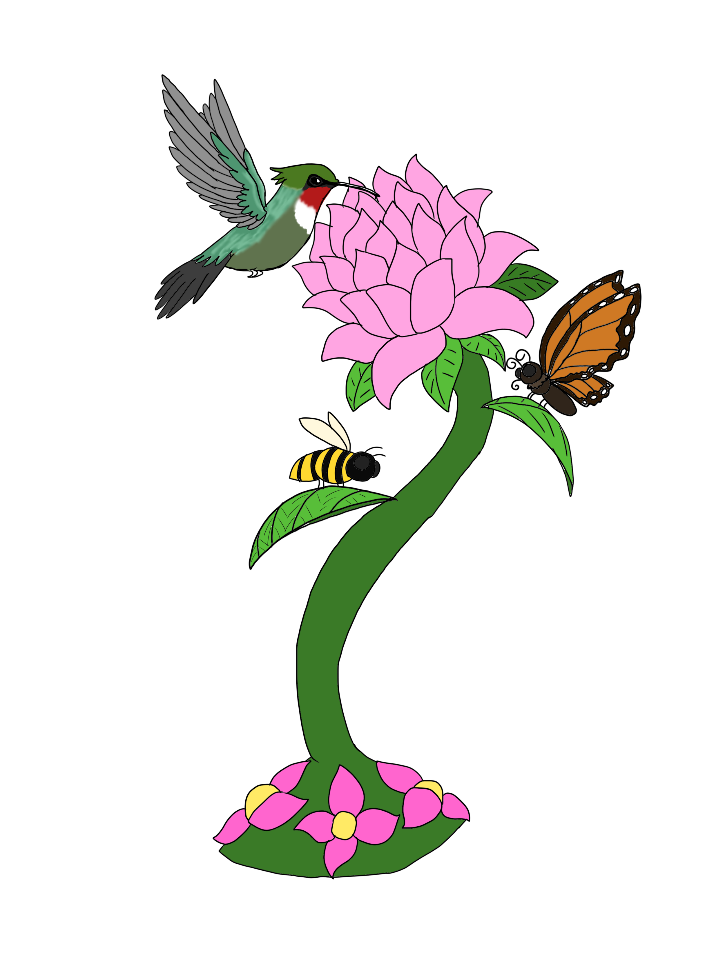
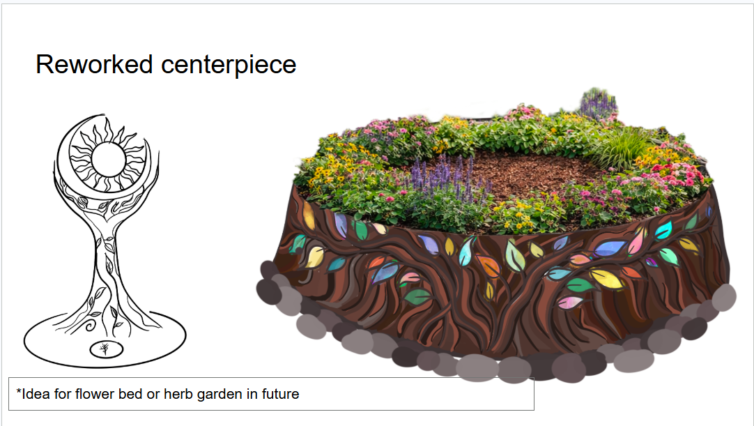
The sculpture designs were dedicated to the animals that are native to Michigan and help pollinate the plants. Each design includes about three types of pollinator creatures and some native flowers. The image on the left was a beginning concept, but it was too overwhelming. The middle picture was a redesign, more simplistic, which became the final decision. The image on the right is the final, digital design of the sculpture, but my concept did not make it to our group’s proposal.
March 20th
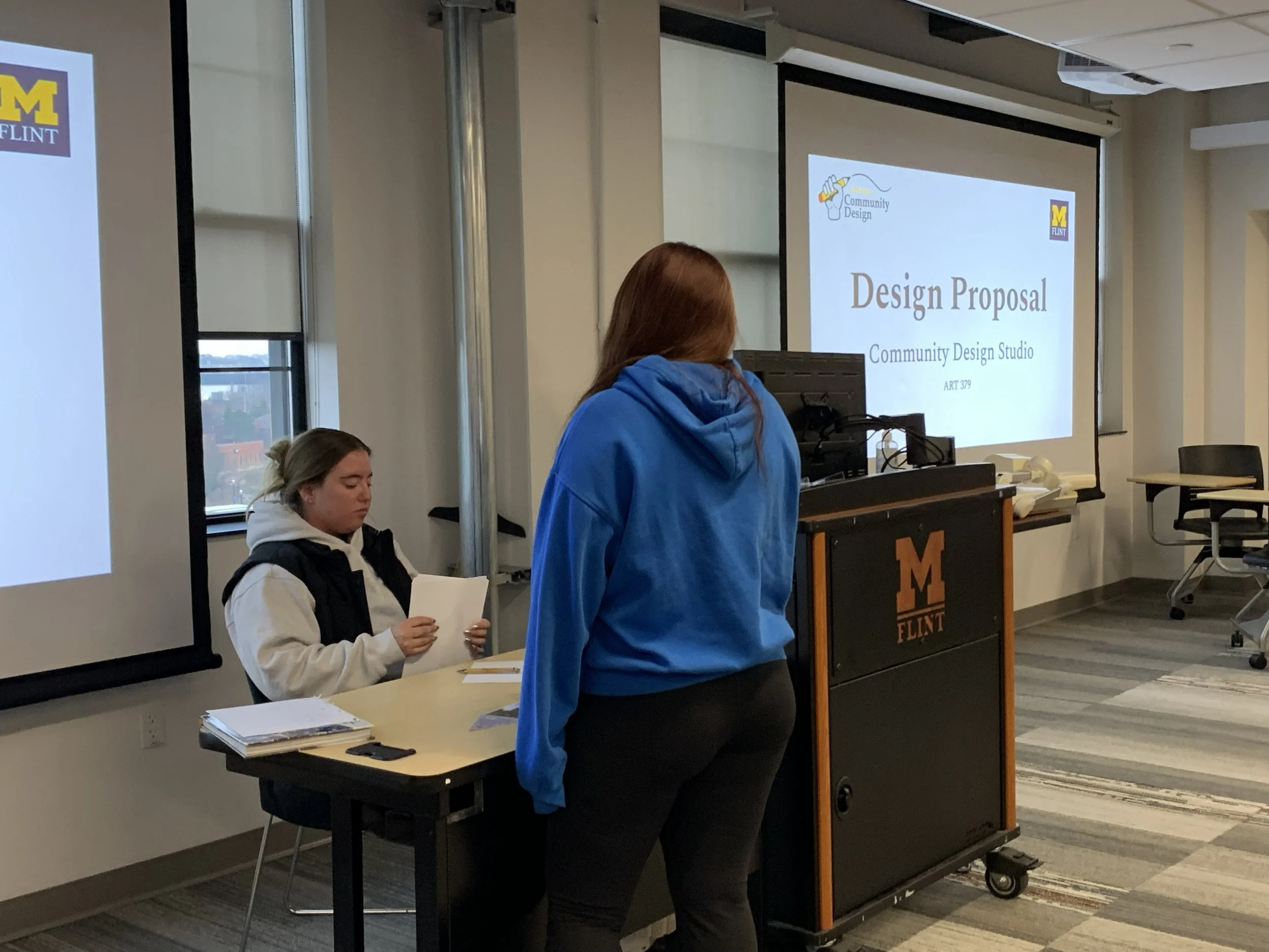
On March 20th, the collaborators of Pierce Park Nature Preserve met up with our Community Design Studio class to discuss our proposal for the project. The proposal maintained our top three final designs for the park’s logo, top three signage designs for the plant garden, and some sculptures for the centerpiece of the garden.
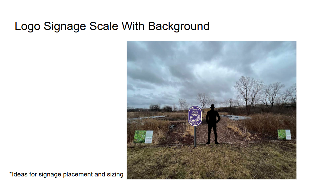
Revisioned Logo Signage
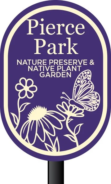
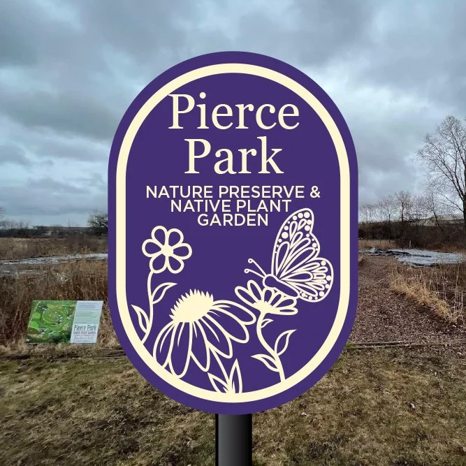
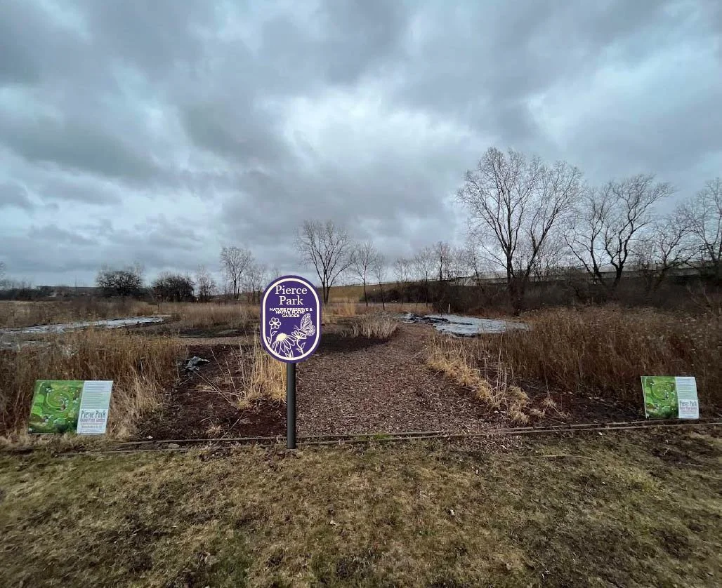
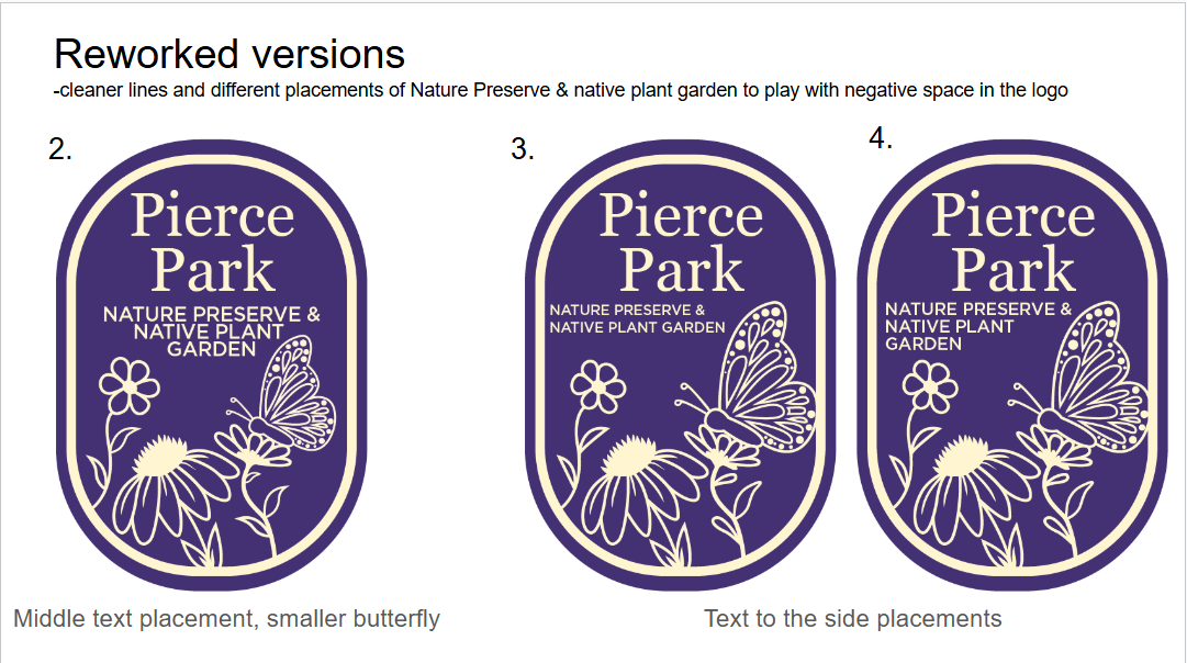
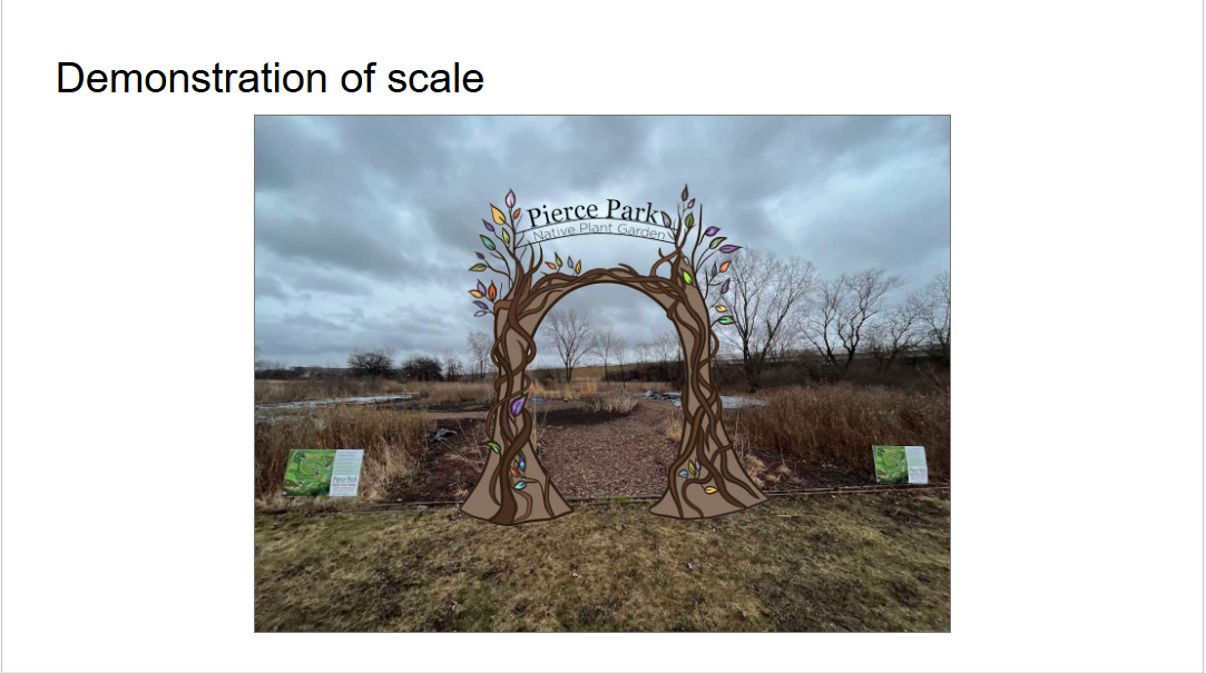
Below are the logo signage that were chosen as the final designs by the Pierce Park coordinator. Fellow student McKenzie designed the signage, and I volunteered to help with the scale of the signs.
Community Design Studio Final Designs
Below are the revised, final designs that we collaborated on with Pierce Park. Although none of my designs made the final, I helped clean up the designs. Below are designs created by classmates in the Community Design Studio class. The logo and center sculpture were made by my friend Mackenzie, and the plant signage was designed by my friend Willow.
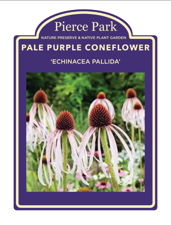
Flower Sign Designs
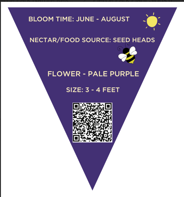
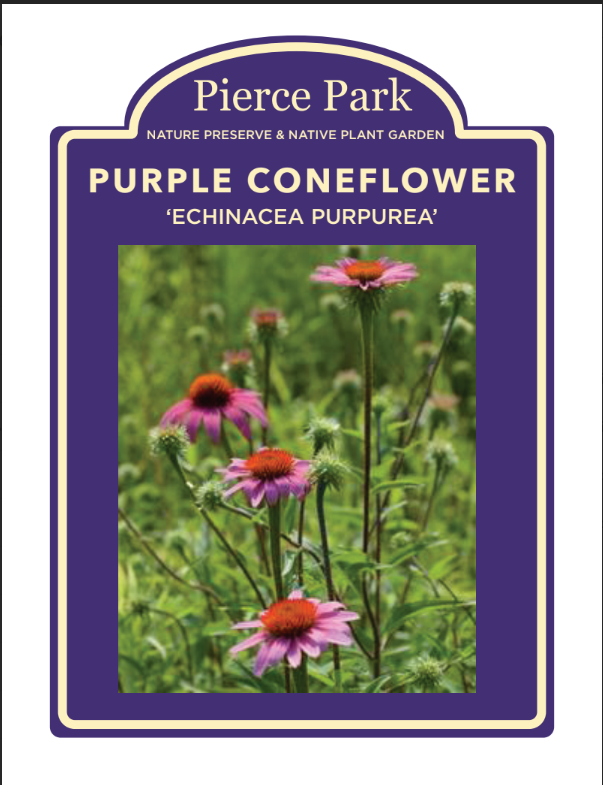
The Pierce Park associates wanted us to tweak the sign template for the flowers. Each student redesigned and did two flower signs for Pierce Park. Below are the two flowers I decided to participate in making. The first image is the Pale Purple Coneflower, and the second image is the Purple Coneflower.